How a proposal request for "an elegant, leisurely, lean-back experience for the iPad" evolved into a strategic initiative that fundamentally changed how Getty Images thinks about and engages with their users.

The client request
Designers learn very early on that "we are not the customer but we try our best to think like one".
We remind ourselves of this often, so as we explore ideas and solutions we avoid getting derailed by personal preference. So imagine our thrill when thinking like a customer suddenly became effortless — because when it came to this client, we are their customer.
It wasn't hard finding enthusiastic people in the studio who wanted to participate in the pitch effort, but as we dug deeper, we realized that the client's request didn't align with the realities of their highest-value customers — creative professionals (like us) with hectic workdays.
Our preliminary research confirmed our suspicions...
Creative professionals rarely have time when we can "lean back" and peruse a stock photo site for inspiration at a leisurely pace.
For a media company or agency, there are time constraints and deadlines, reviews and approvals, and procurement people pulling the purse-strings at every turn.
The pitch: OWN THE ECOSYSTEM
Based on our preliminary research findings, and a touch of informed intuition, I went "beyond the ask" and pitched the client on what we believed they needed —
an omni-channel "lean-forward" experience that addressed the primary pain-points identified in each stage of the customer journey, including the oft overlooked aspects of managing and archiving assets (and their license constraints) once a project has concluded.

Research deep-dive
Following the project kick-off, our research focused on understanding the customer's stock imagery sourcing process, how mobile devices factor in to their work, and understand sources of inspiration.
What we learned was:
- Creatives don’t use their mobile device as a primary tool… yet.
- Distractions and interruptions are rampant in the workplace… there’s no time to just stop and think.
- While there is some level of sharing happening, it appears to be inefficient and inconsistent.
- By the time customers get to Getty Images, they're already in a creative problem solving mindset.
- Customers are applying pre-conceived filters before an image search even begins.
- Current curation and governance processes used by customers are cumbersome and inefficient.
BY THE NUMBERS
Big takeaway from the competitive analysis:
Several other companies doing parts of the process in silos, but no one owning the stock imagery ecosystem it end-to-end.

I synthesized our research into a set of
behavioral archetypes, mapping key roles in the stock imagery acquisition process, across media, publishing, and agency segments, while also capturing vital metrics for context in experience mapping.
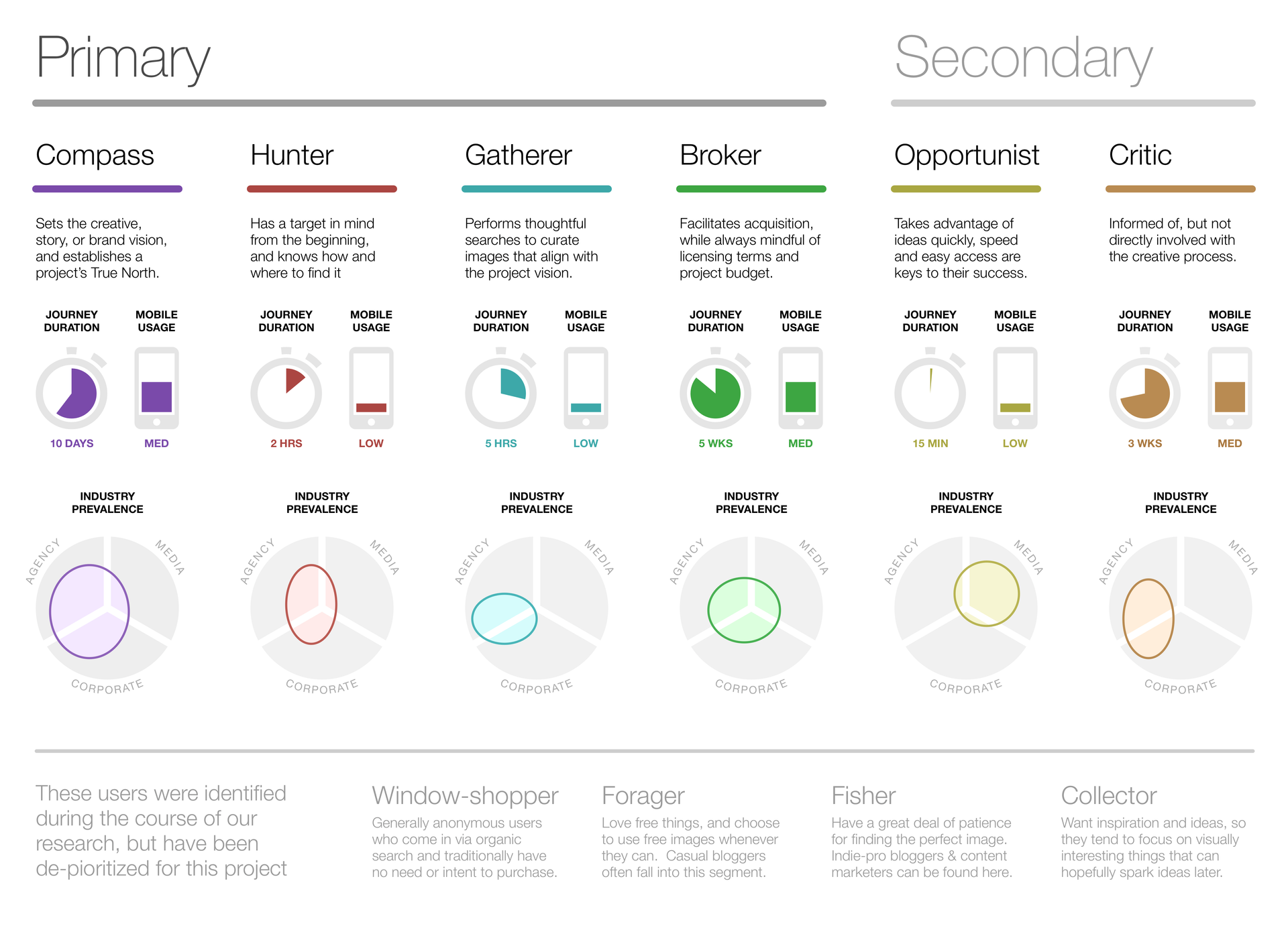
Though archetype groups are segmented according to behaviors, multiple roles can be found within each segment. Some roles may cross groups, depending on how the responsibilities of those roles are defined in different companies.

The research also shed some light on the major stages of the customer journey, and the activity levels of each archetype therein.

Mapping the customer experience
Once we had a solid picture of our customers, it was time to invite the client to participate in an experience mapping workshop.
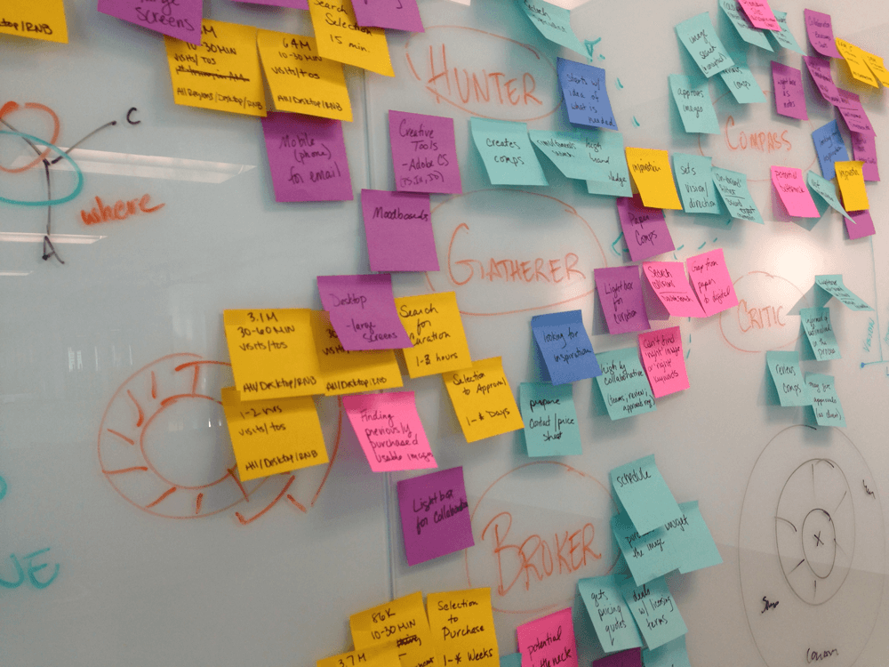
Over two days, I facilitated the team’s efforts to plot the customer journey for every archetype (including activity levels for each phase), highlight moments of pain and delight, and capture the commonalities between each journey. The typical duration of each journey was also included to provide context for evaluating opportunities.
Design POV + guiding principles
It was my responsibility to absorb and interpret the client's various brand guidelines, weigh them against what we were looking to accomplish with the digital experience, and formulate a point-of-view for the project team.
This work was the result of a close partnership between the myself and the creative leads on the client side, in order to ensure its authenticity.
Since the goal of the project had evolved to focus on an app experience for two separate client brands, we took great care to craft a delicate balance between the two from a visual perspective but still have both grounded by the same foundational philosophy.
A play within a play
During the course of the project, the client was talking with Apple about a potential partnership — this turned into an opportunity for our work to be featured as a demo in an upcoming Apple event.
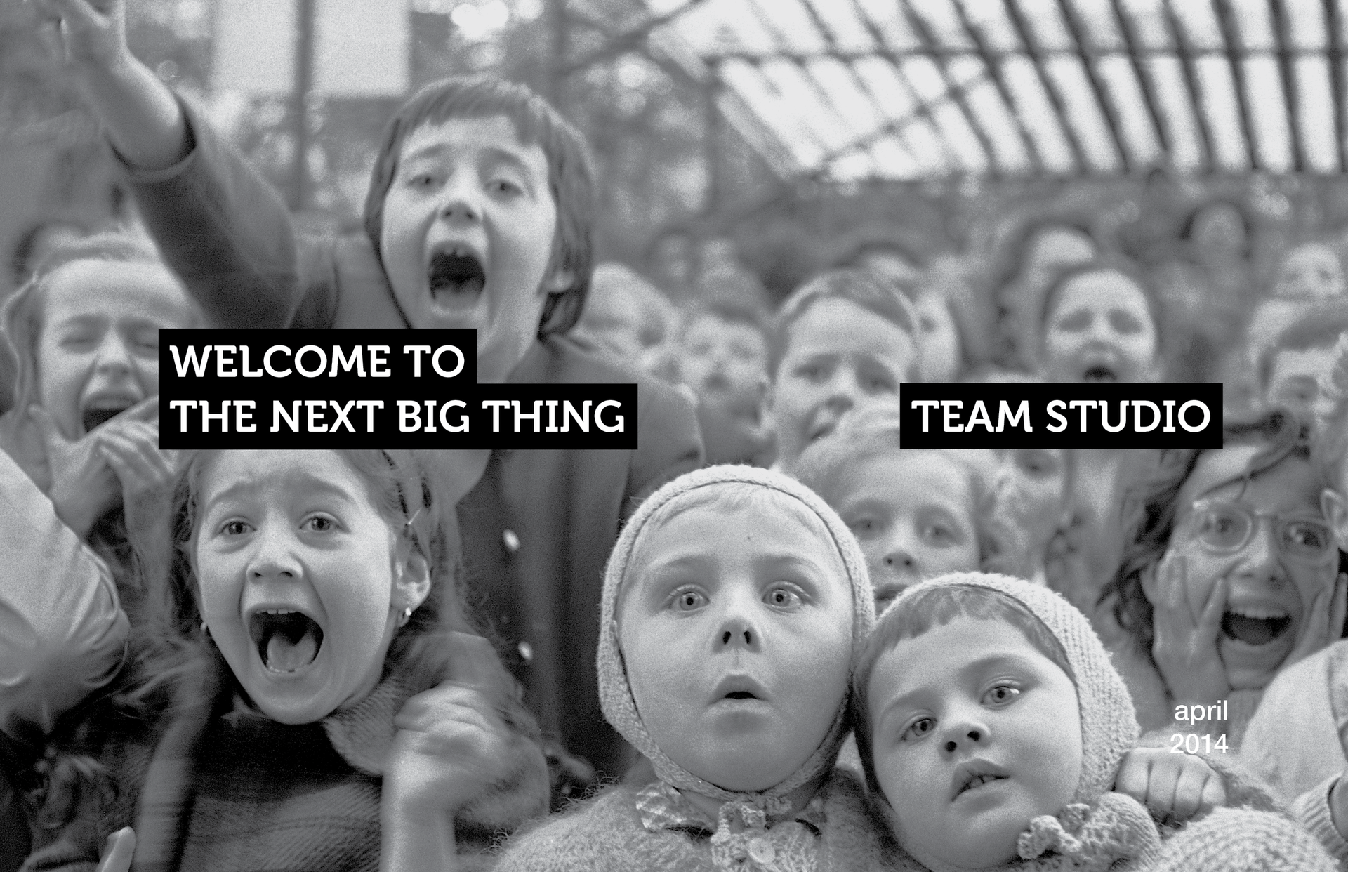
This opportunity came up mid-stream during two intense parallel design/dev efforts, so needless to say it was a daunting challenge. I didn't want to derail the teams as we still had milestones to hit — so I spent three weeks singlehandedly crafting an interactive story+demo combo compiled into an iPad app.
Slide title
Write your caption hereButton
Slide title
Write your caption hereButton
Slide title
Write your caption hereButton
Slide title
Write your caption hereButton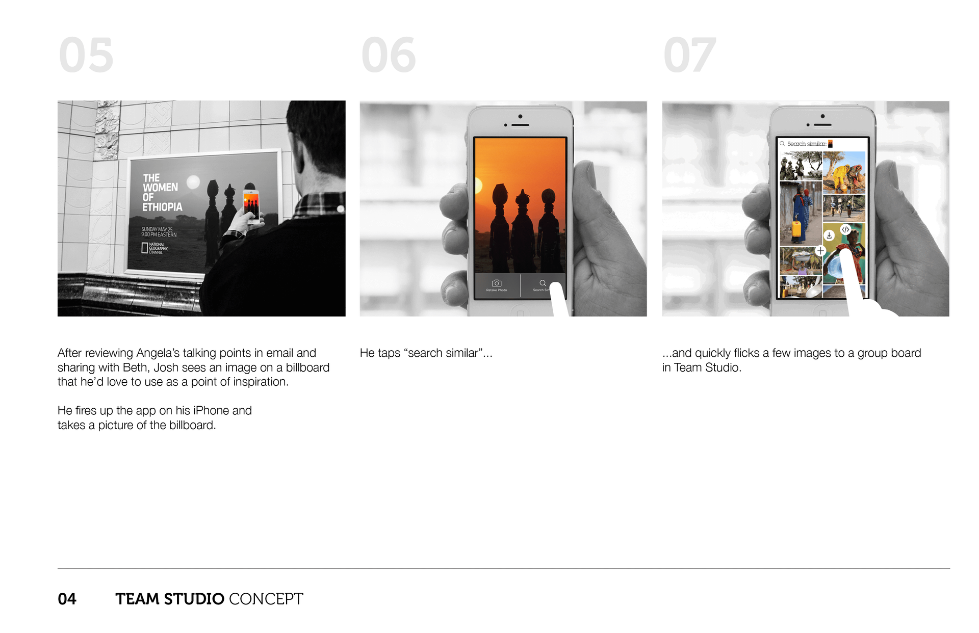
Slide title
Write your caption hereButton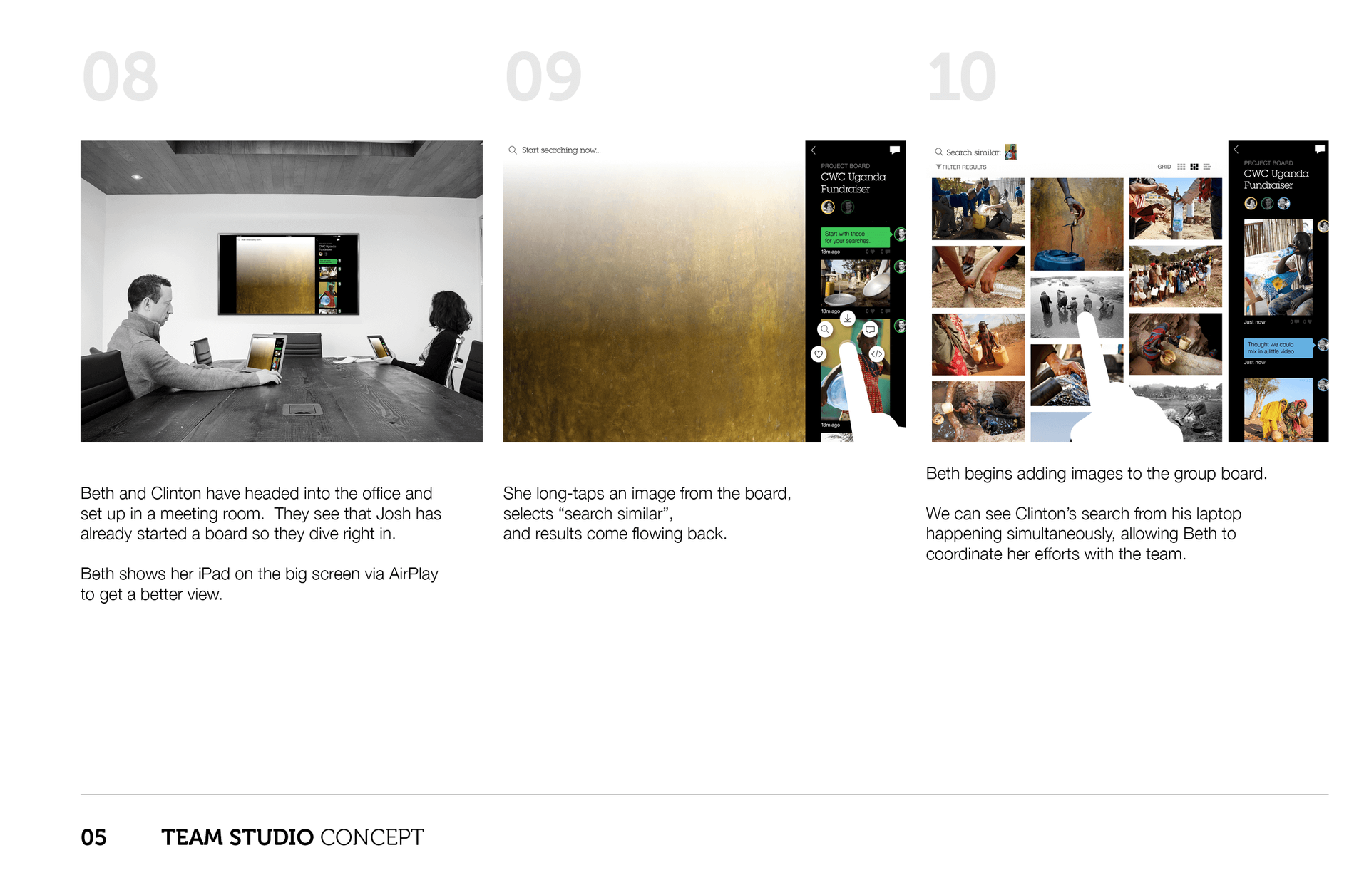
Slide title
Write your caption hereButton
Slide title
Write your caption hereButton
Slide title
Write your caption hereButton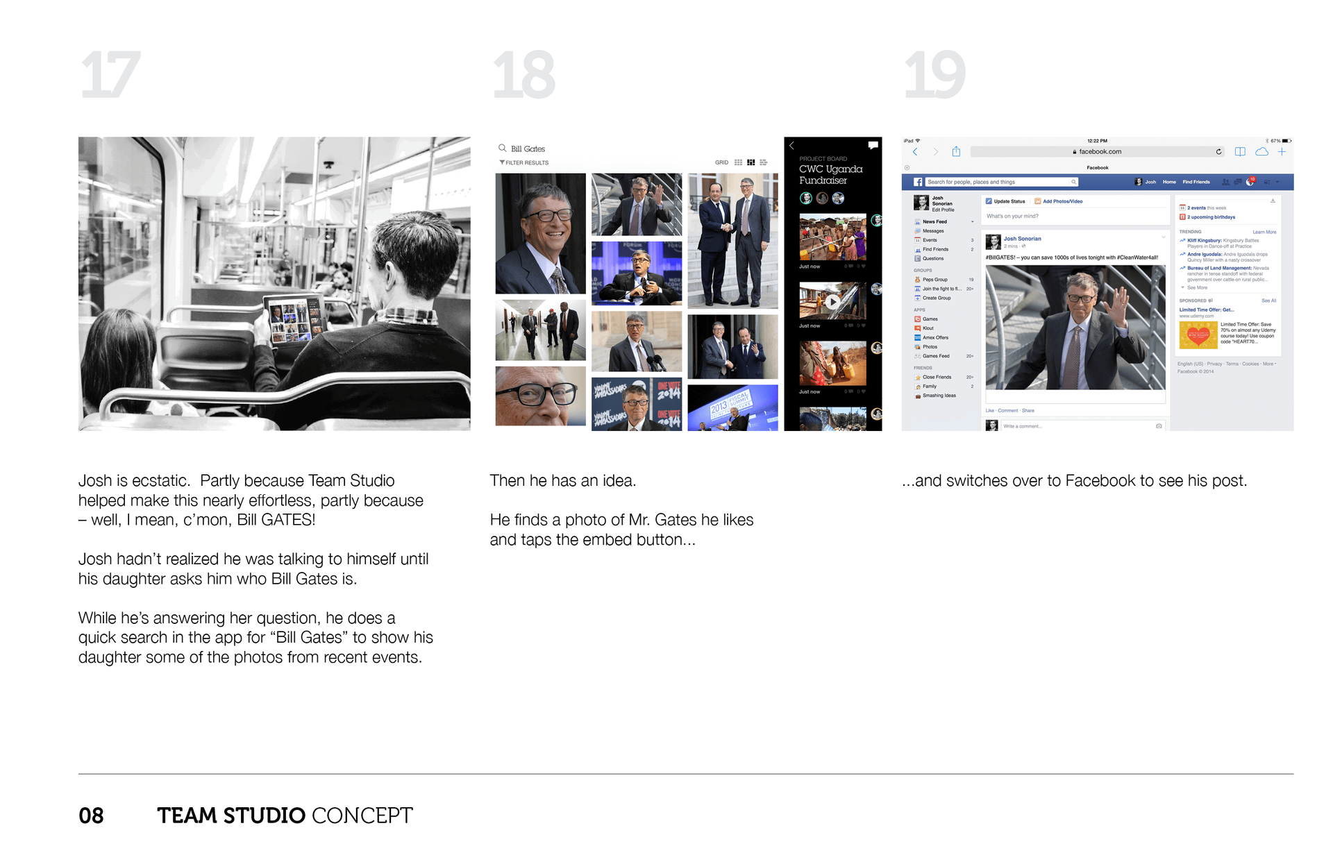
Slide title
Write your caption hereButton
Slide title
Write your caption hereButton
Slide title
Write your caption hereButton
