DRIVING STRATEGIC INITIATIVES
Reimagining next-gen fleet management at Zonar

2021-2023 · Zonar · Head of UX
This was by far the biggest undertaking by Zonar during my tenure there, and involved the hands, hearts, and minds of everyone in the company. Far beyond a mere "redesign", this initiative sought to fundamentally reinvent and modernize our portfolio of products and services — which meant that we would have to reinvent how we work.
- Ground Traffic Control was redesigned and re-engineered from the platform foundation to be more flexible, scalable, and adaptive to customer needs.
- Customer needs were refocused around JTBDs so we’re highly confident that what we’re delivering to market is not just usable but valuable.
- A modern, modular infrastructure and wayfinding philosophy called “no dead-ends” that incorporated best-practices around content-as-navigation and contextual micro-help, serving the target goal of reducing support calls by 10% YoY.
- Object-based design and dev (DSPLY) to reduce rework and “rogue work”, fostering a more consistent level of product quality throughout our product ecosystem.
STEERING INTO THE SKID
The "Ground Traffic Control Experience" initiative (dubbed GTCx for short) came out of an annual retrospective and planning meeting.
In the spirit of "what got us here won't get us there", there was sweeping consensus that market forces were creating headwinds for the company, and competitors that didn't exist three years prior were beginning to be a legitimate and tangible threat.
Everyone agreed that it was "now or never" to shed the old, outdated codebase, the inflexible database architecture, and the dream-of-the-90s UI aesthetic for a flagship product worthy of the 21st century.

Since this was a cross-functional effort with stakeholders in every department of the company and dozens of folks thinking and working on various aspects in parallel, effective communication and coordination was key.
I took it upon myself to establish and lead a steering committee, comprised of the key functional leaders accountable for the initiative.
We would meet weekly and focus on sharing progress from various working groups, discuss "escalations", track actuals vs the roadmap plan, manage blockers or dependencies and determine what should be communicated out to the broader org each week.
But first, we needed to establish some ground rules...
For our first meeting, I conducted a mindmapping activity, centered around three questions:
- What are the EVERGREEN goals of this committee?
- What do we value and what are our priorities?
- What might be getting in our way?
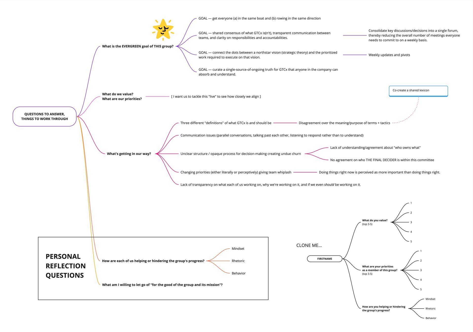
This helped the steering committee start off on the right foot with how we would collaborate and make decisions, and modeled the behavior we'd expect from the working groups throughout the coming months.
DESIGNING + BUILDING WITHOUT LEARNING IS JUST GUESSING
It was well known that the major reason why our current FMS was not meeting customer needs and expectations well was a painful lack of customer research and validation testing on Zonar's part.
We'd begun to course-correct that from an organizational capability perspective, but our foray into ResearchOps was still in its infancy.
To avoid pushback, I needed to find a way to help the org shift our thinking from "what feature or report can we roll out to sell next?" to "what is going to deliver the most value to our customers?" — and it had to be fairly intuitive, easy to adopt, and well established.
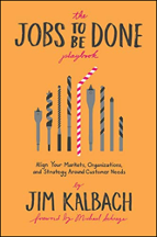
I pitched the Jobs-To-Be-Done Framework — and specifically the playbook by Jim Kalbach because it was chock full of practical tools and methods for research, planning, and directional validation.
Aligning to JTBDs created a point of convergence with PM, UX and ENG — all the way down to the job story in a JIRA ticket — that we could point to and say with confidence "we know what we're building and why".
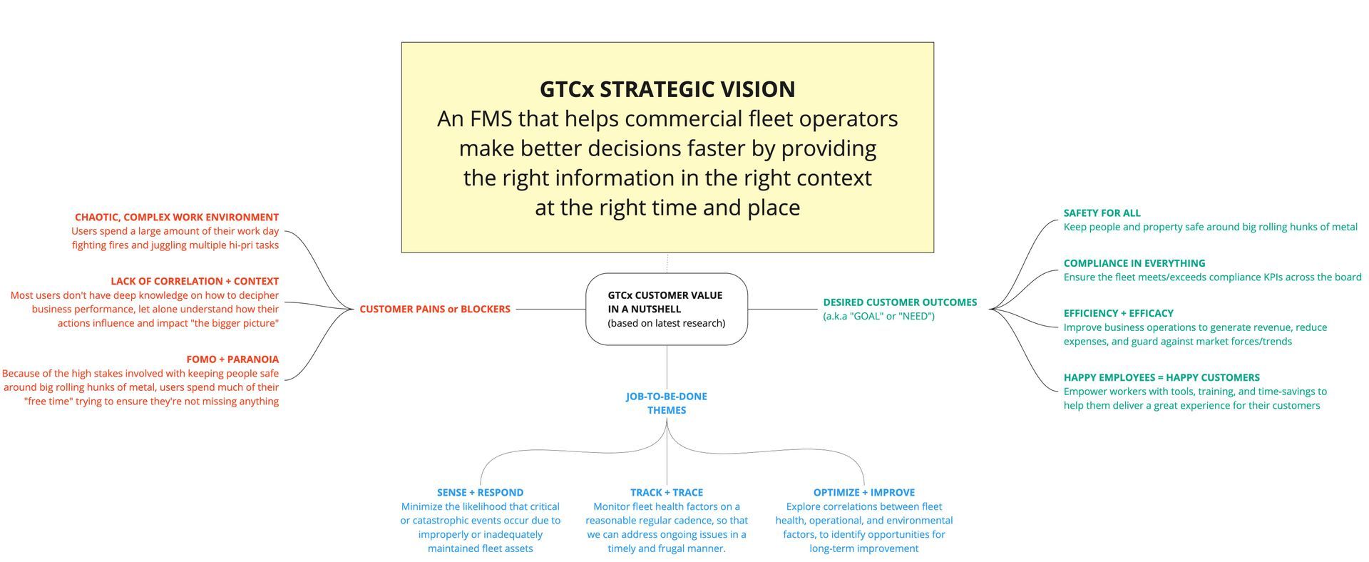
And the playbook helped me zero in on the desired customer outcomes of our core user groups, their current blocking issues, and uncover a variety of interrelated JTBDs that I categorized into themes.
NO DEAD-ENDS
One of the most daunting challenges my team and I had identified early on was how to consolidate and refactor a variety of disparate, product-centric IA and navigational approaches into a unified and intuitive SaaS-centric experience for our FMS customers.
A very long sentence that basically meant "we work in silos".
Since Information Architecture and scary-big problems are two of my favorite things, I dove at the chance to lead the thinking around this.
Slide title
Write your caption hereButton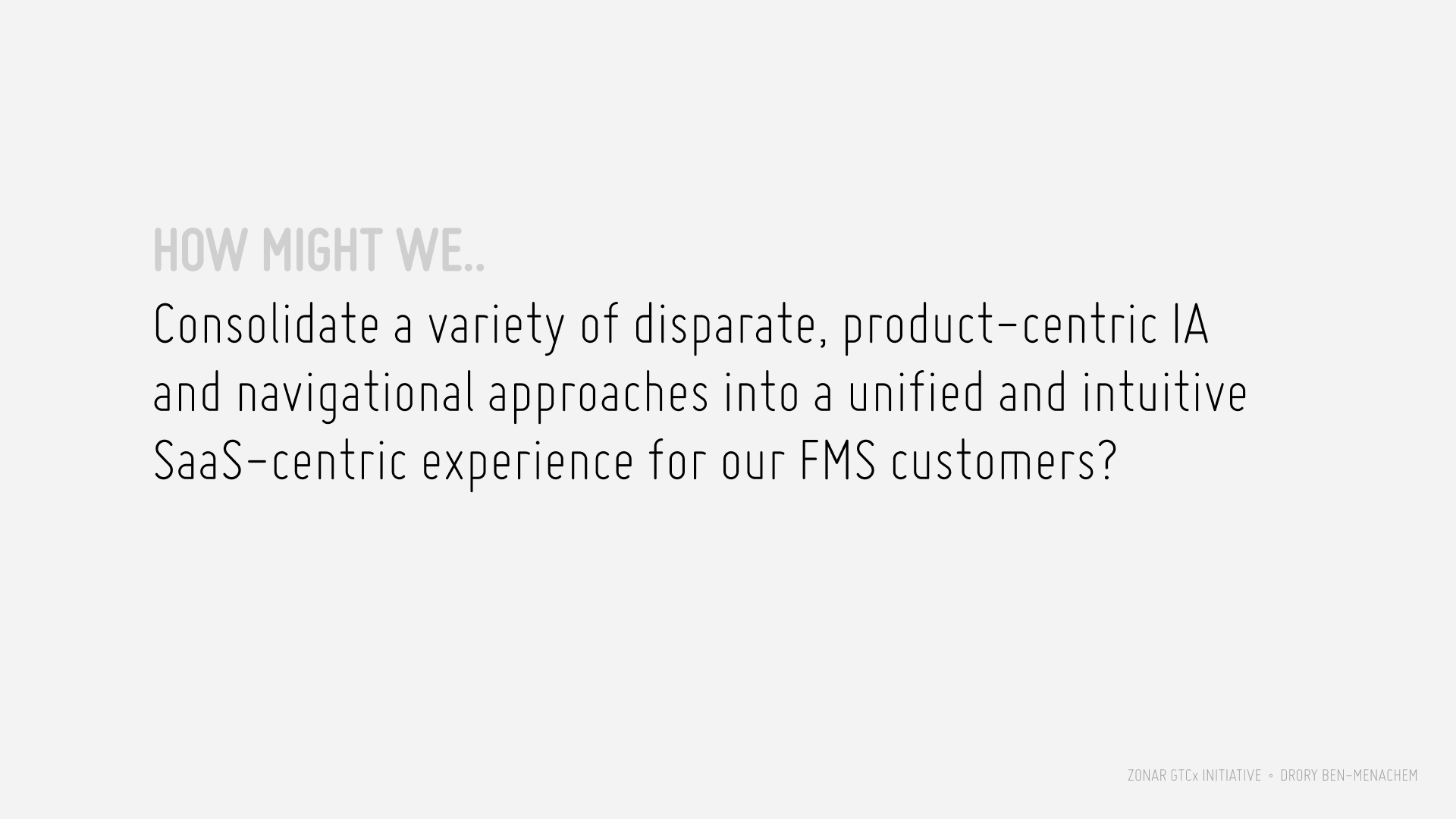
Slide title
Write your caption hereButton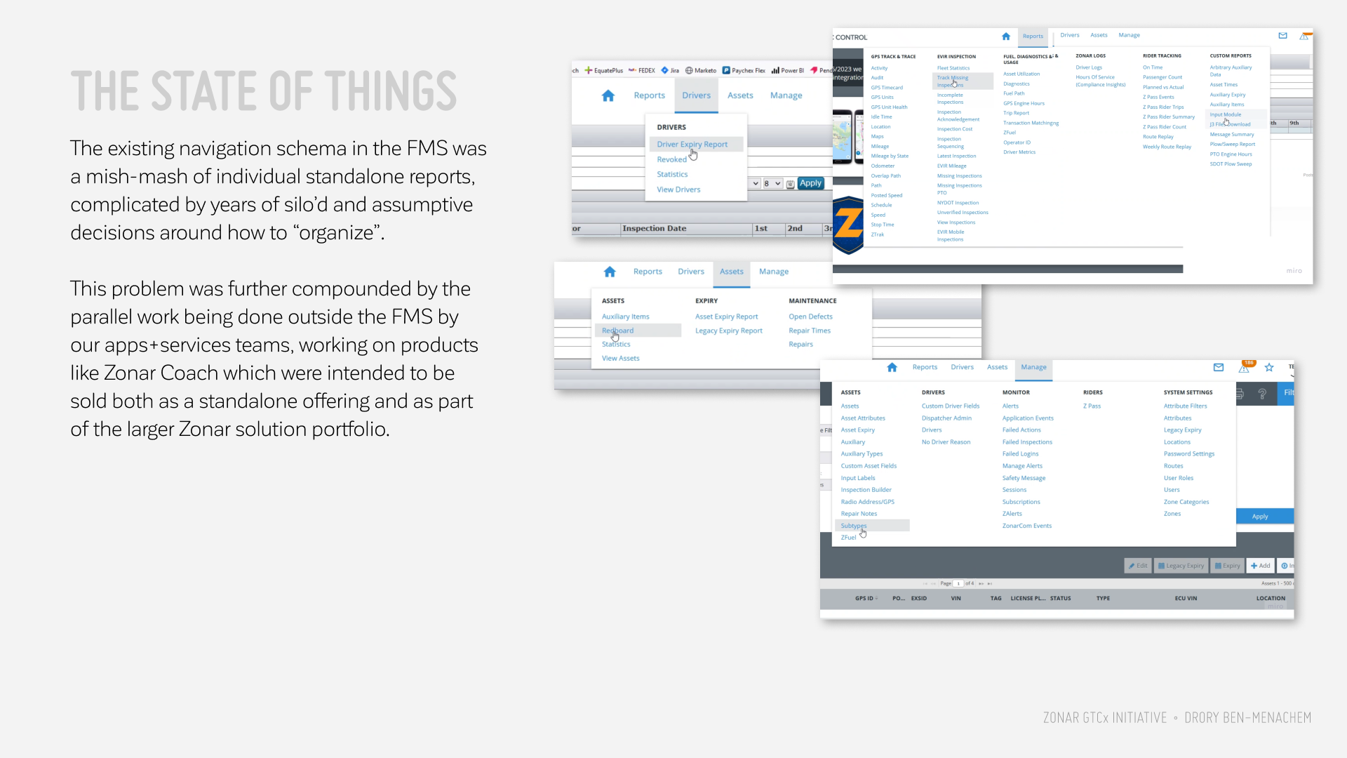
Slide title
Write your caption hereButton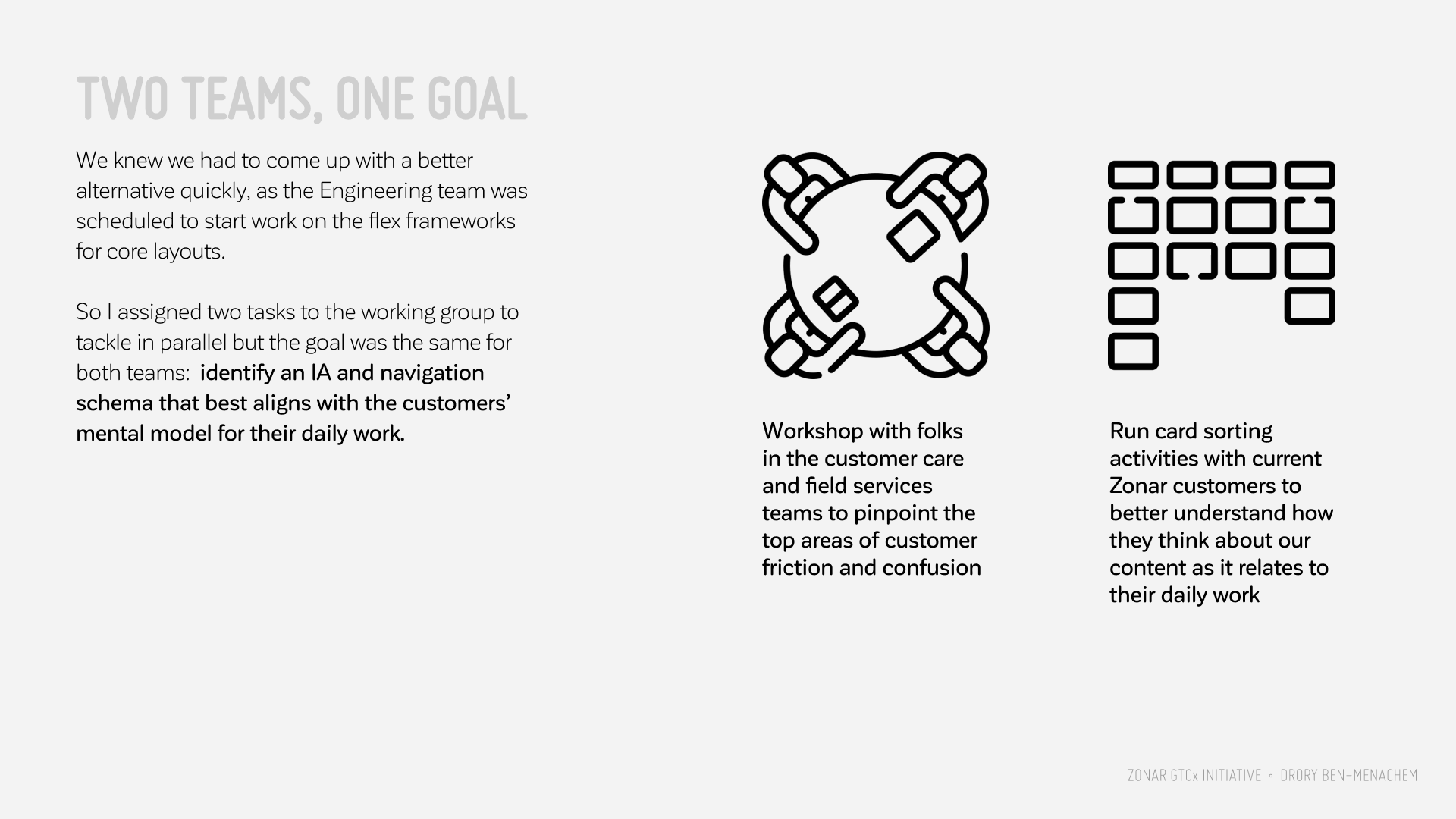
Slide title
Write your caption hereButton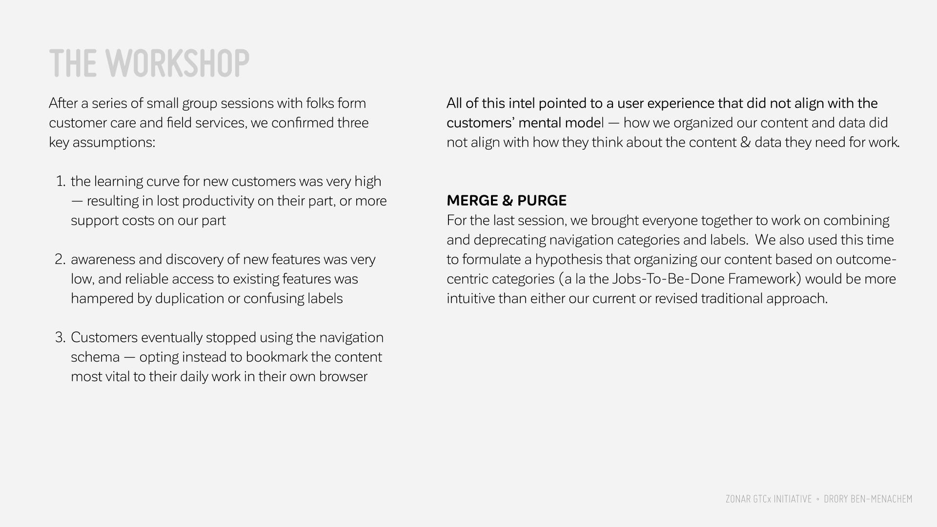
Slide title
Write your caption hereButton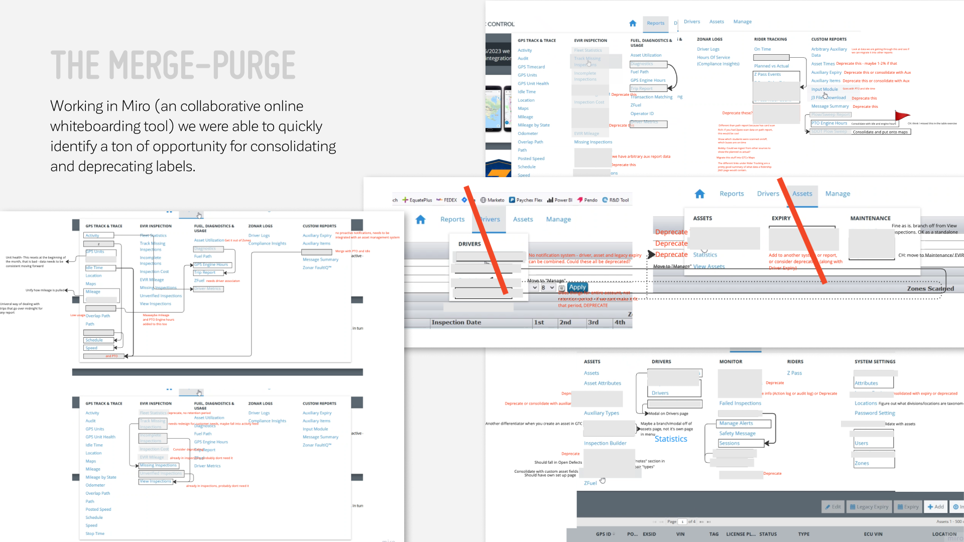
Slide title
Write your caption hereButton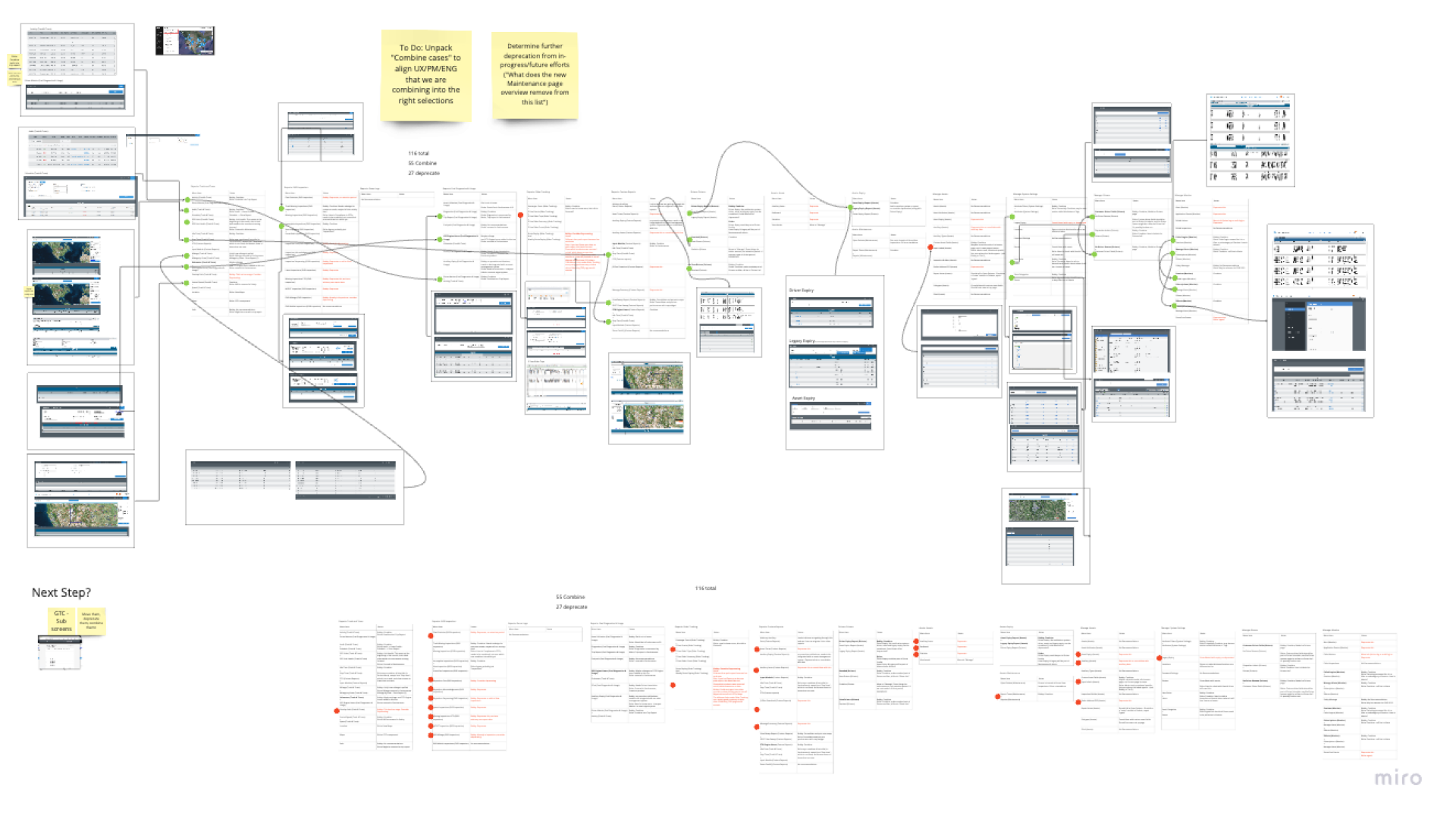
Slide title
Write your caption hereButton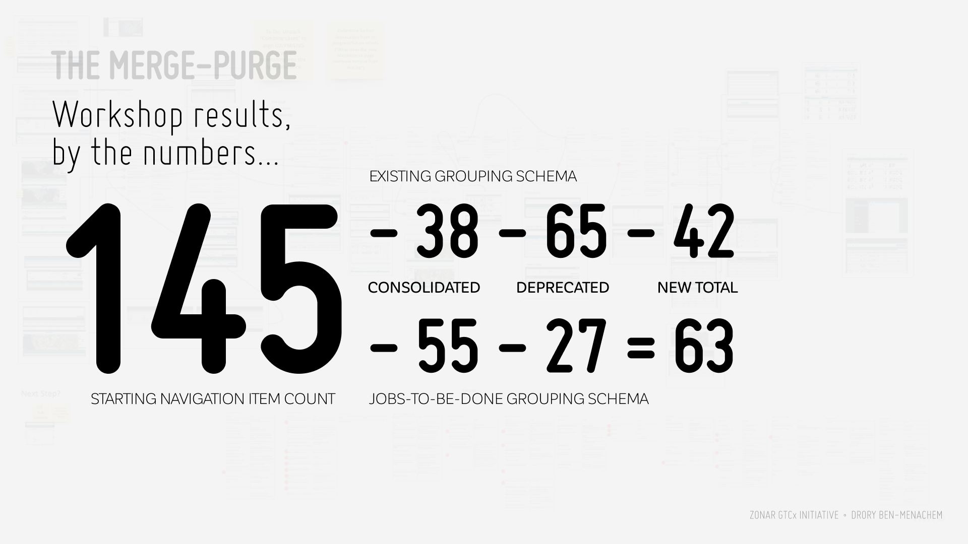
Slide title
Write your caption hereButton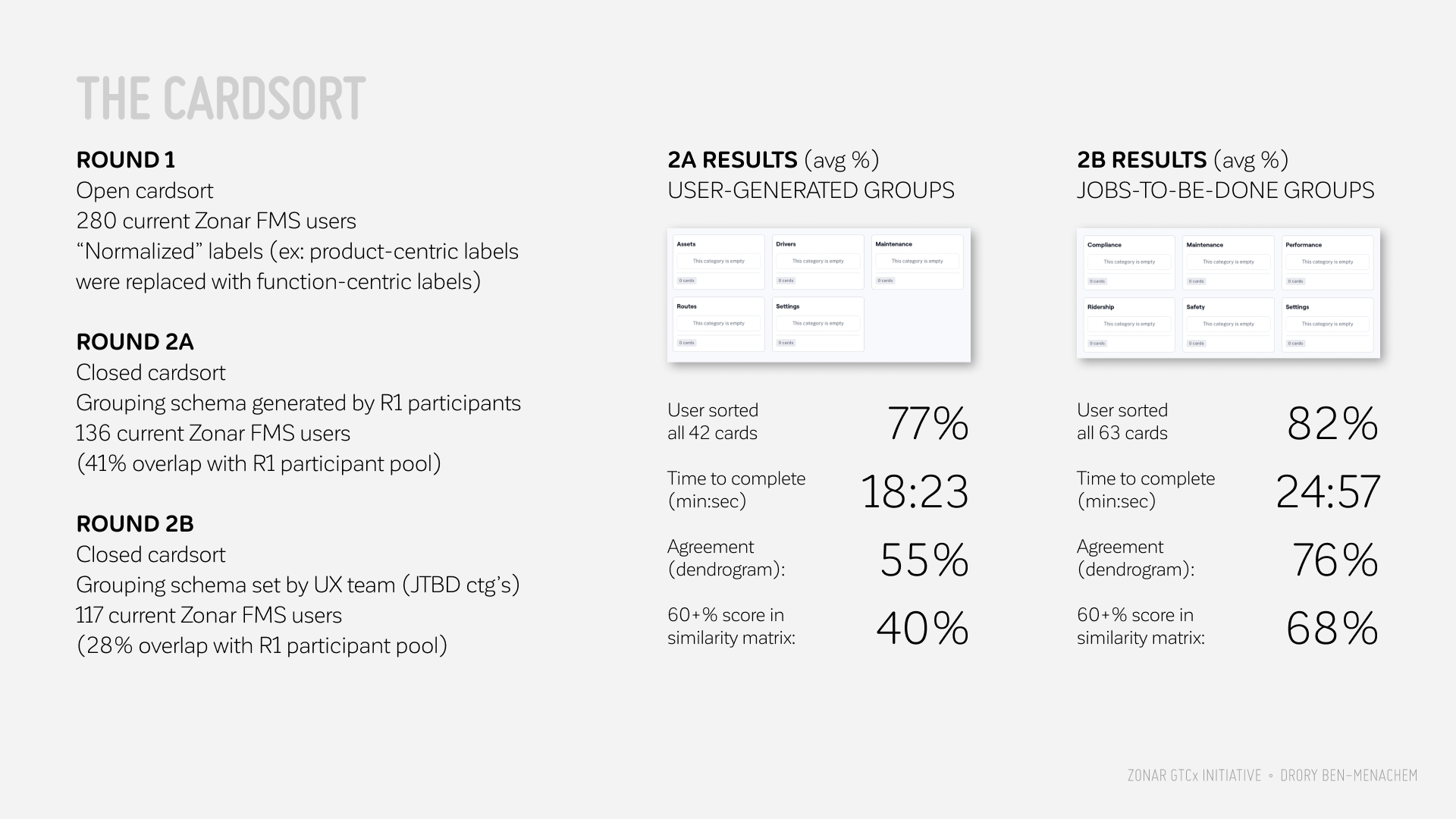
Slide title
Write your caption hereButton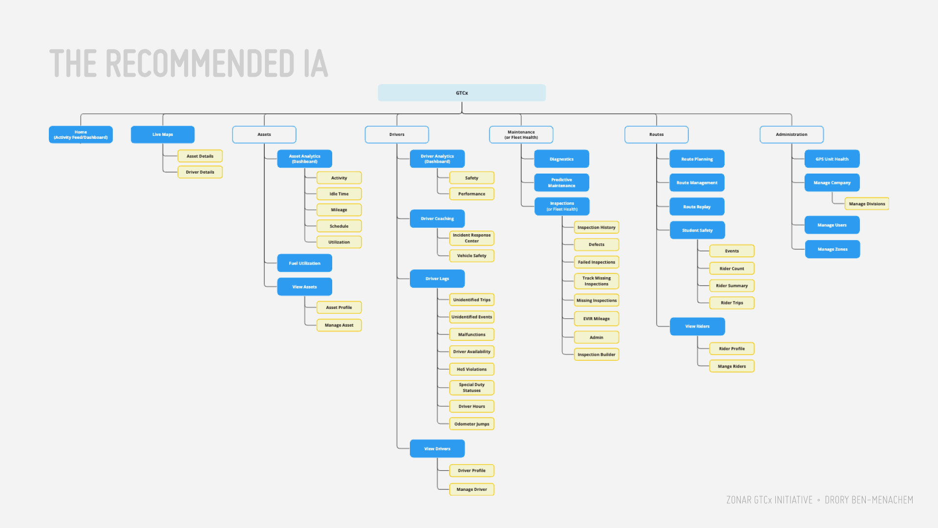
Slide title
Write your caption hereButton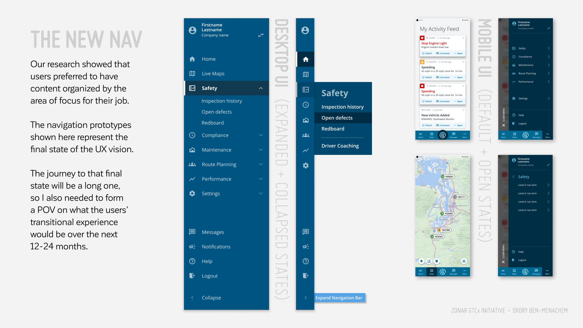
Slide title
Write your caption hereButton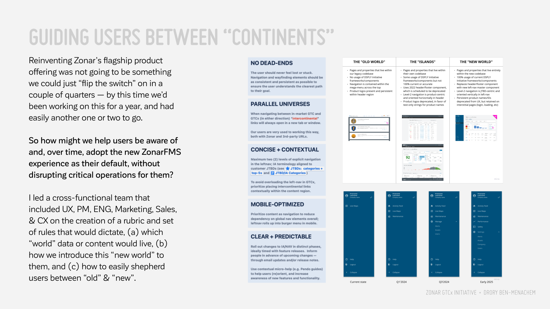
Slide title
Write your caption hereButton
Slide title
Write your caption hereButton
MAKE IT A #ONEZONAR EXPERIENCE
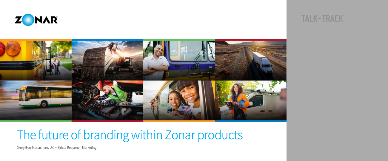
While working through the IA problem space, one of the "boulders" we had to design around was the plethora of product logos that currently enjoyed a persistent presence in the product experience.
I brought some friends from Marketing into the discussion very early on to explore the idea of "no product logos in the UI moving forward" — to which they were surprisingly open to. So I partnered with them on this.
Slide title
Write your caption hereButton
Slide title
Write your caption hereButton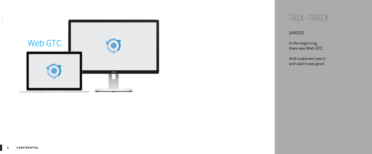
Slide title
Write your caption hereButton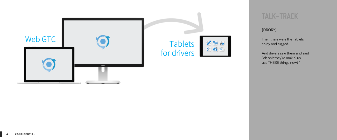
Slide title
Write your caption hereButton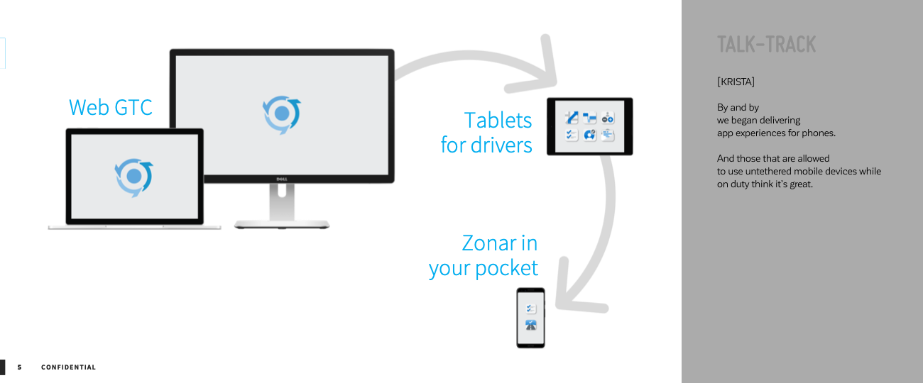
Slide title
Write your caption hereButton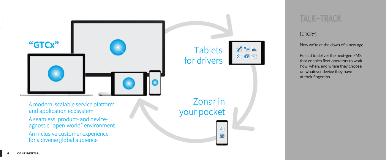
Slide title
Write your caption hereButton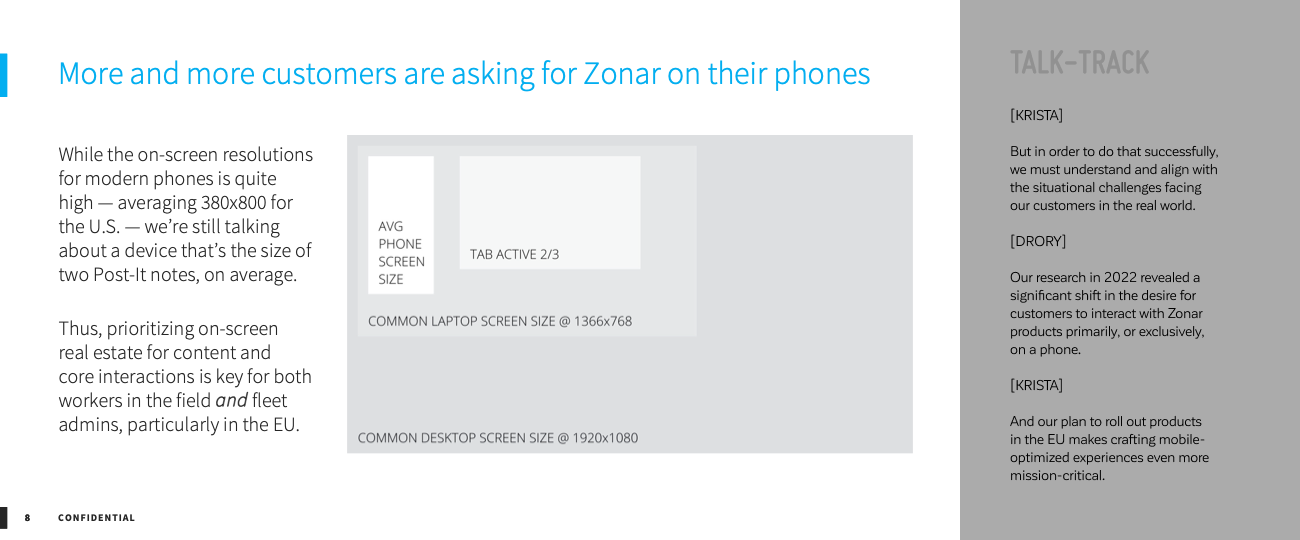
Slide title
Write your caption hereButton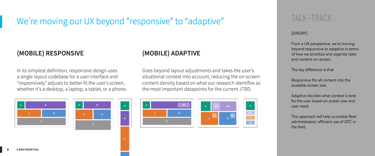
Slide title
Write your caption hereButton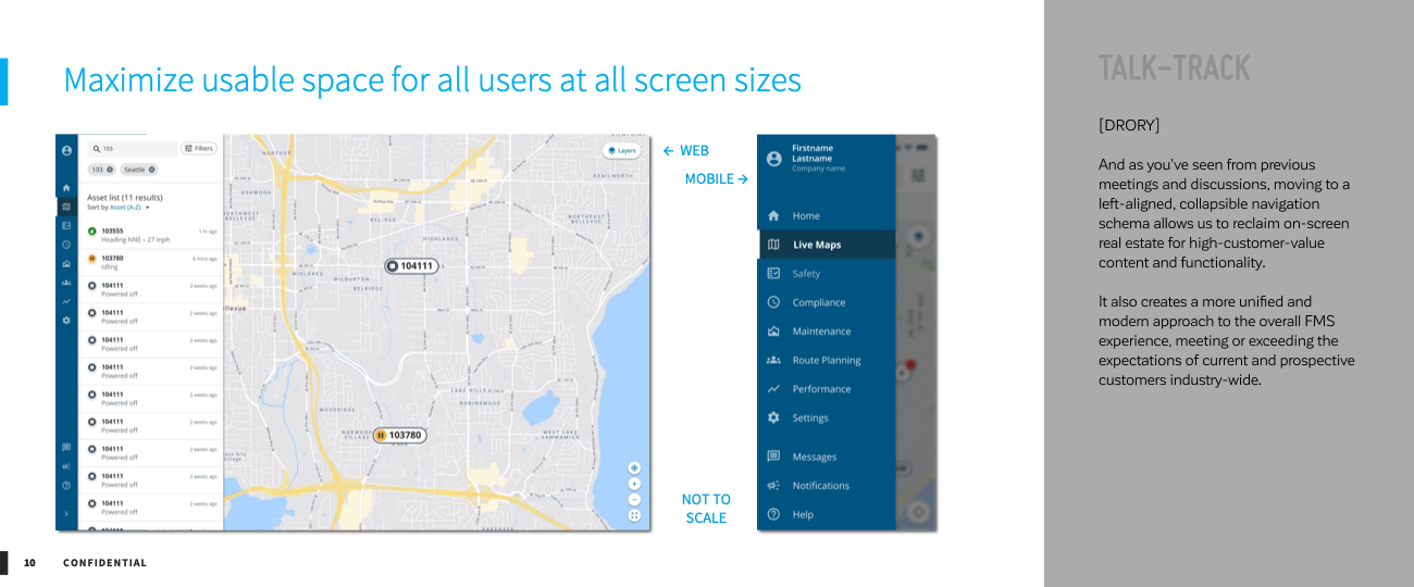
Slide title
Write your caption hereButton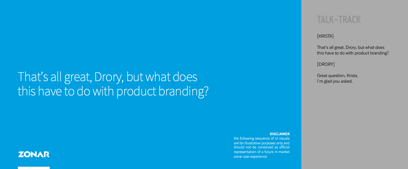
Slide title
Write your caption hereButton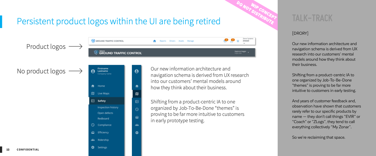
Slide title
Write your caption hereButton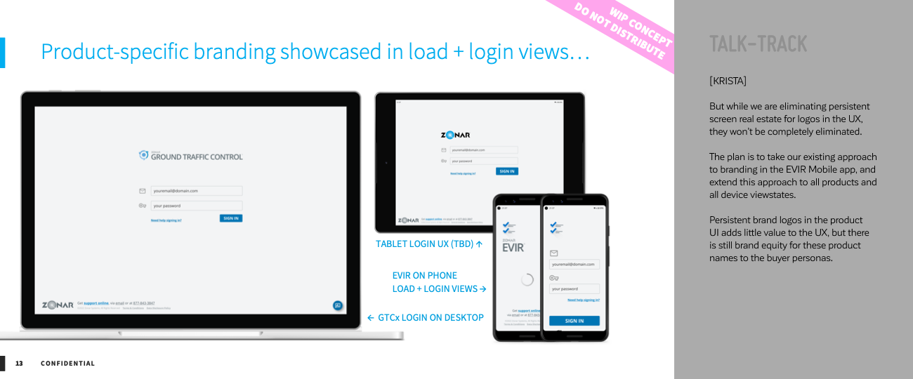
Slide title
Write your caption hereButton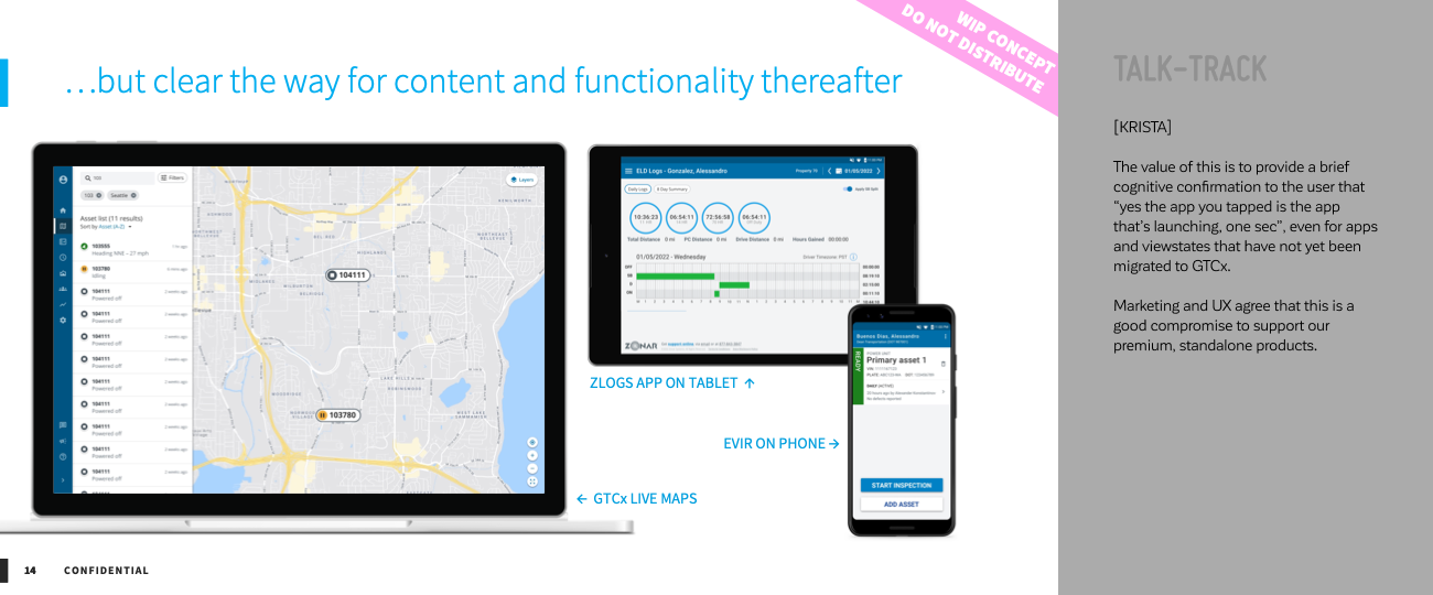
Slide title
Write your caption hereButton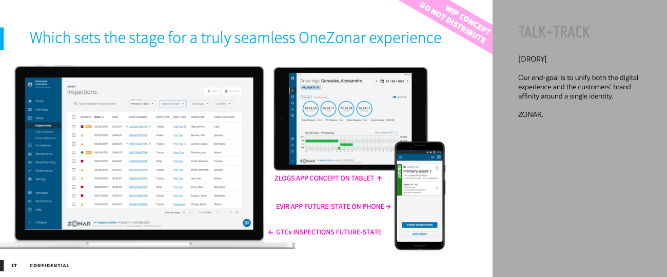
Slide title
Write your caption hereButton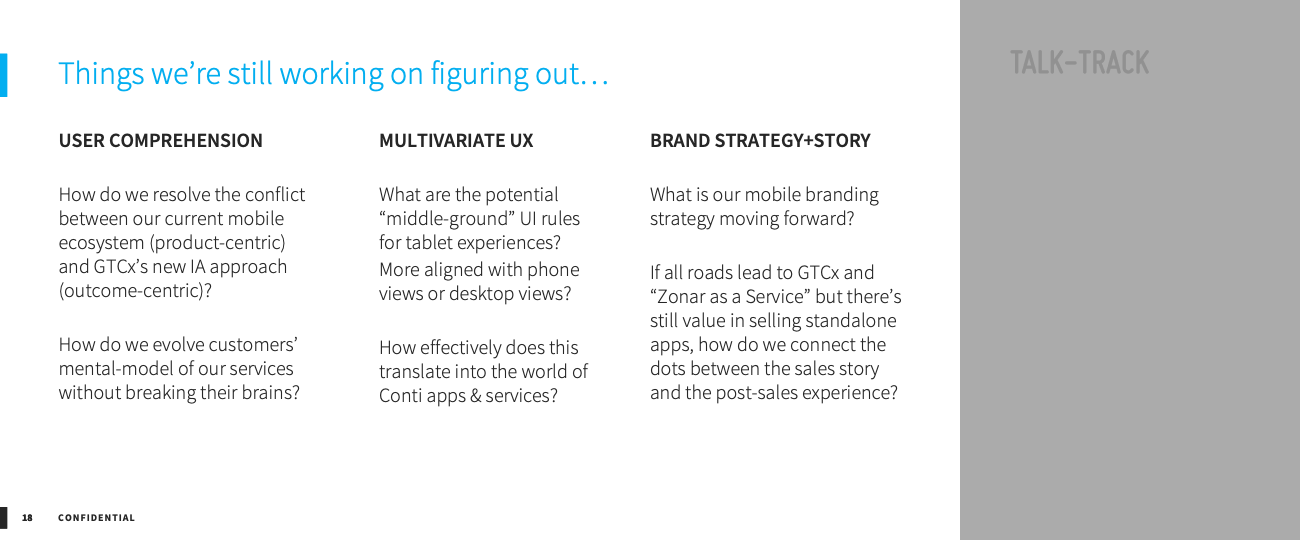
Slide title
Write your caption hereButton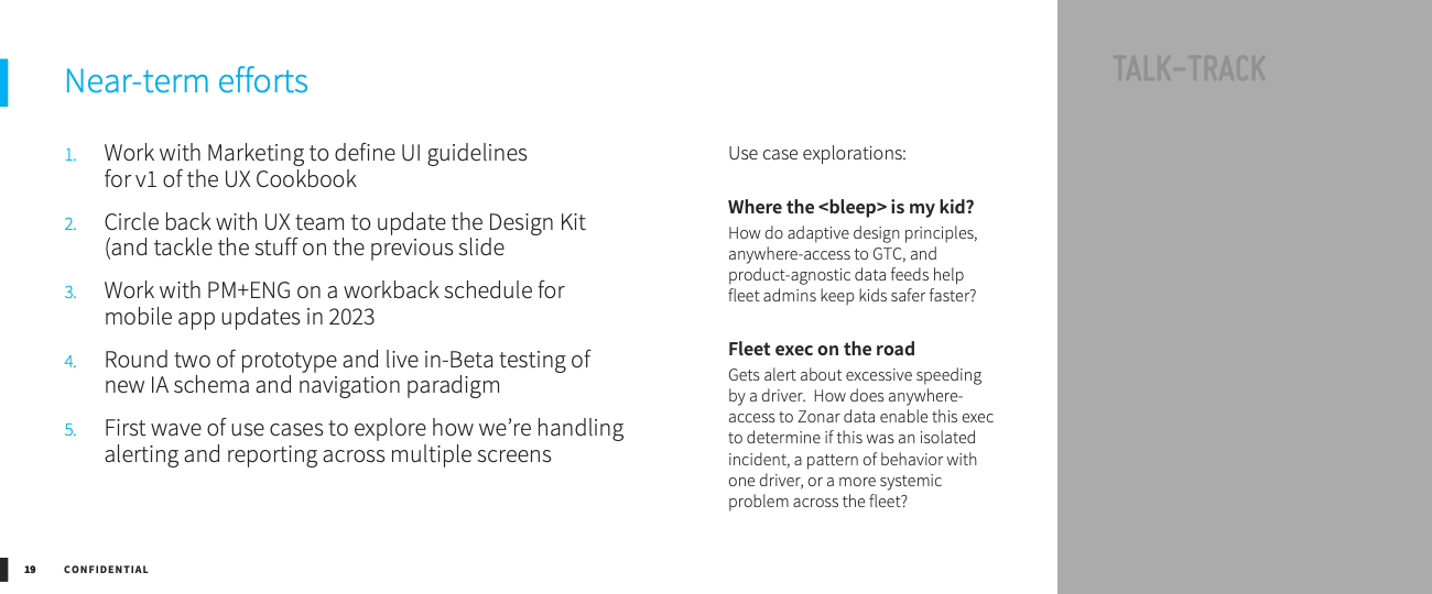
Slide title
Write your caption hereButton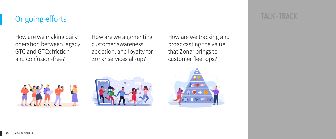
Slide title
Write your caption hereButton
Slide title
Write your caption hereButton
FOCUS ON OUTCOMES TO SCOPE THE OUTPUT
My team and I also (re)introduced the ritual of story-mapping. I say "re" because I had attempted to make story-mapping a thing during my first year at Zonar, but the org wasn't quite ready for it.
This time, I made sure to get buy-in from my fellow leaders first, so that if we encountered pushback from the working groups there would be a unified voice of consensus around integrating this activity into GTCx.
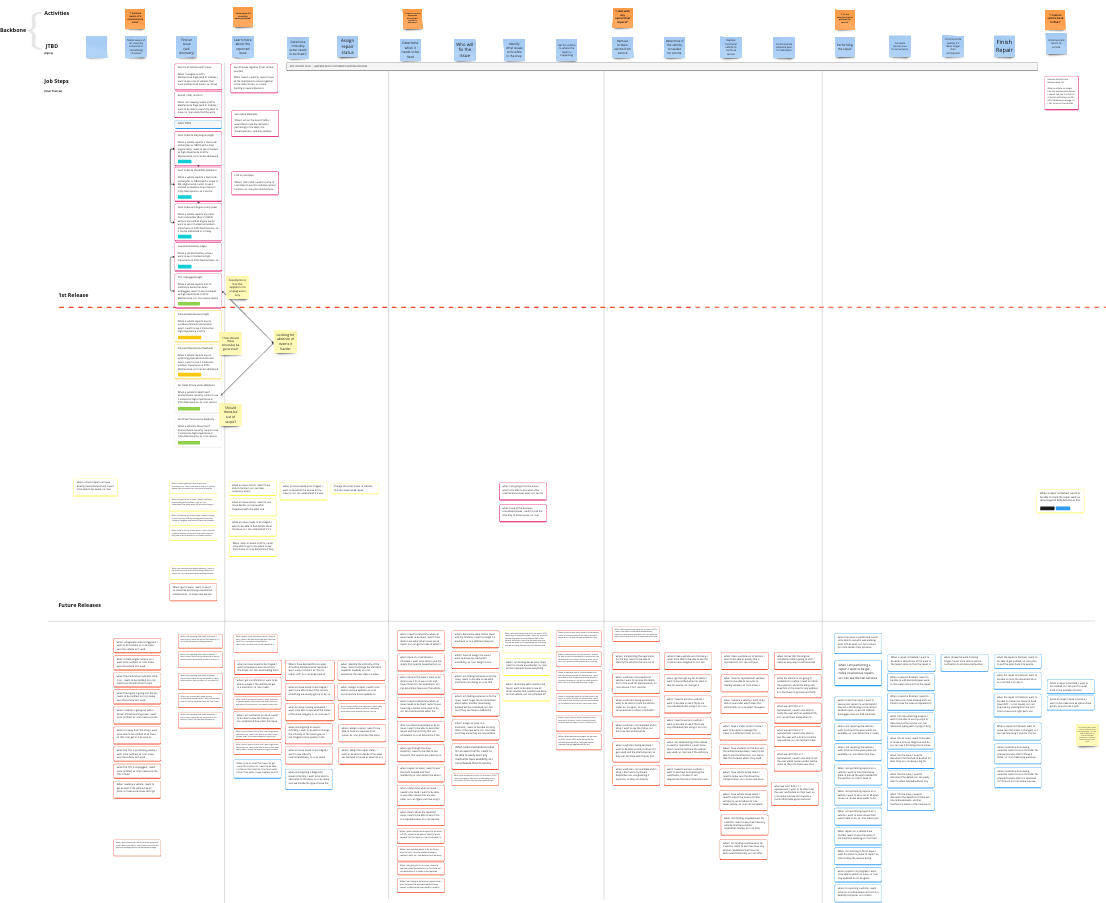
I'd love to show this to you in more detail, but NDAs doncha know?
DESIGN ONCE, USE EVERYWHERE
This is the shared mantra for the DSPLY Initiative, the collaboration between UX and Engineering to establish Zonar's first comprehensive Design System and Pattern Library — the Y stands for "you" because no plan or process or system will endure if the "you"s in the org are not bought in to the idea and have some skin in the game.
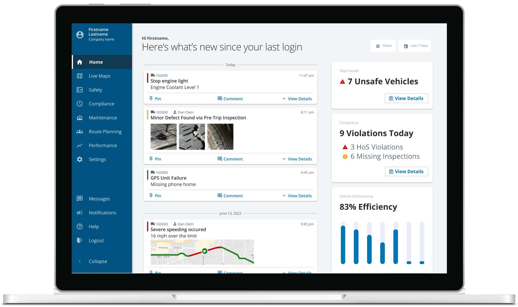
My team and I had spent the previous year building a kit of parts for the Design System side of the DSPLY Initiative, using them in daily work, and testing them with users in various prototypes. So when it came time to embrace the "GTCx work is DSPLY work" approach, we already had the processes and governance in place.
The result of this modular, atomic way of thinking and working with the design helped UX iterate quicker, free up time from the "doing" tasks to spend it on more valuable "thinking" tasks, eliminate unnecessary debates over "this date-picker or that date-picker" and ensure a more consistent level of quality in the final product.
Slide title
Write your caption hereButton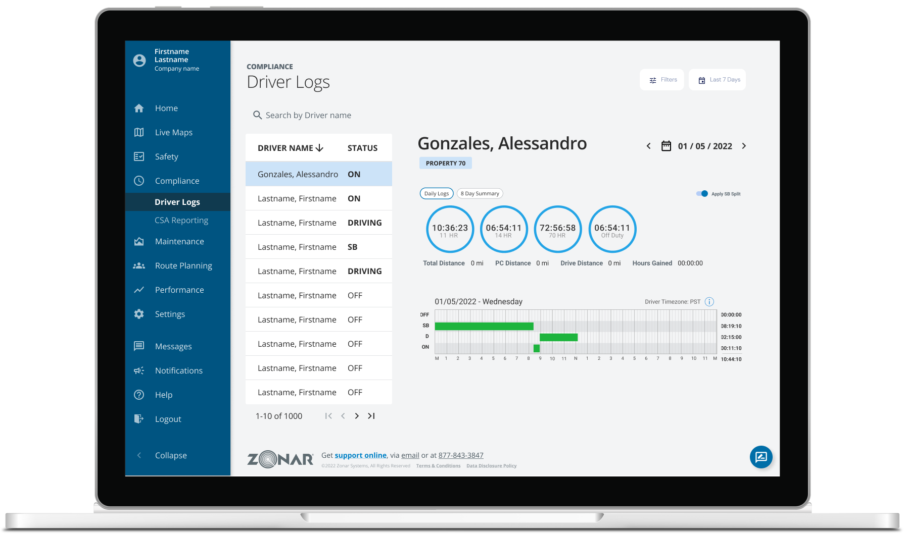
Slide title
Write your caption hereButton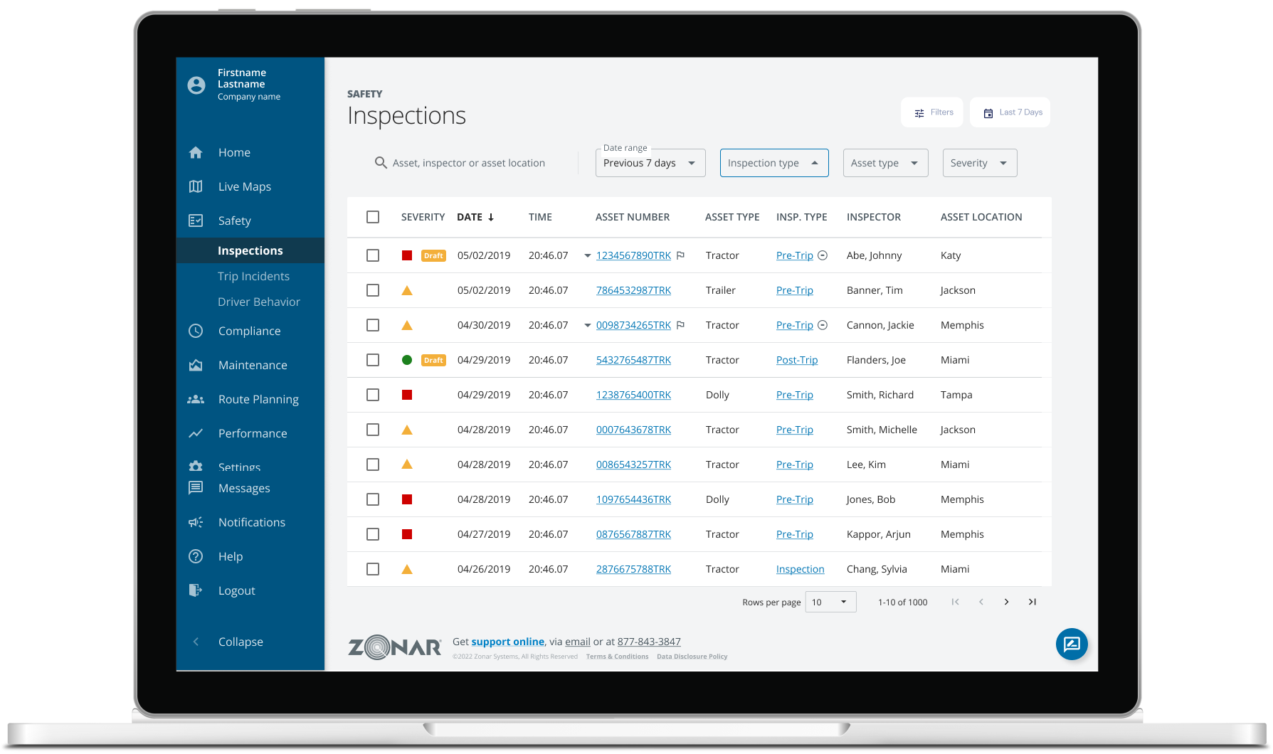
Slide title
Write your caption hereButton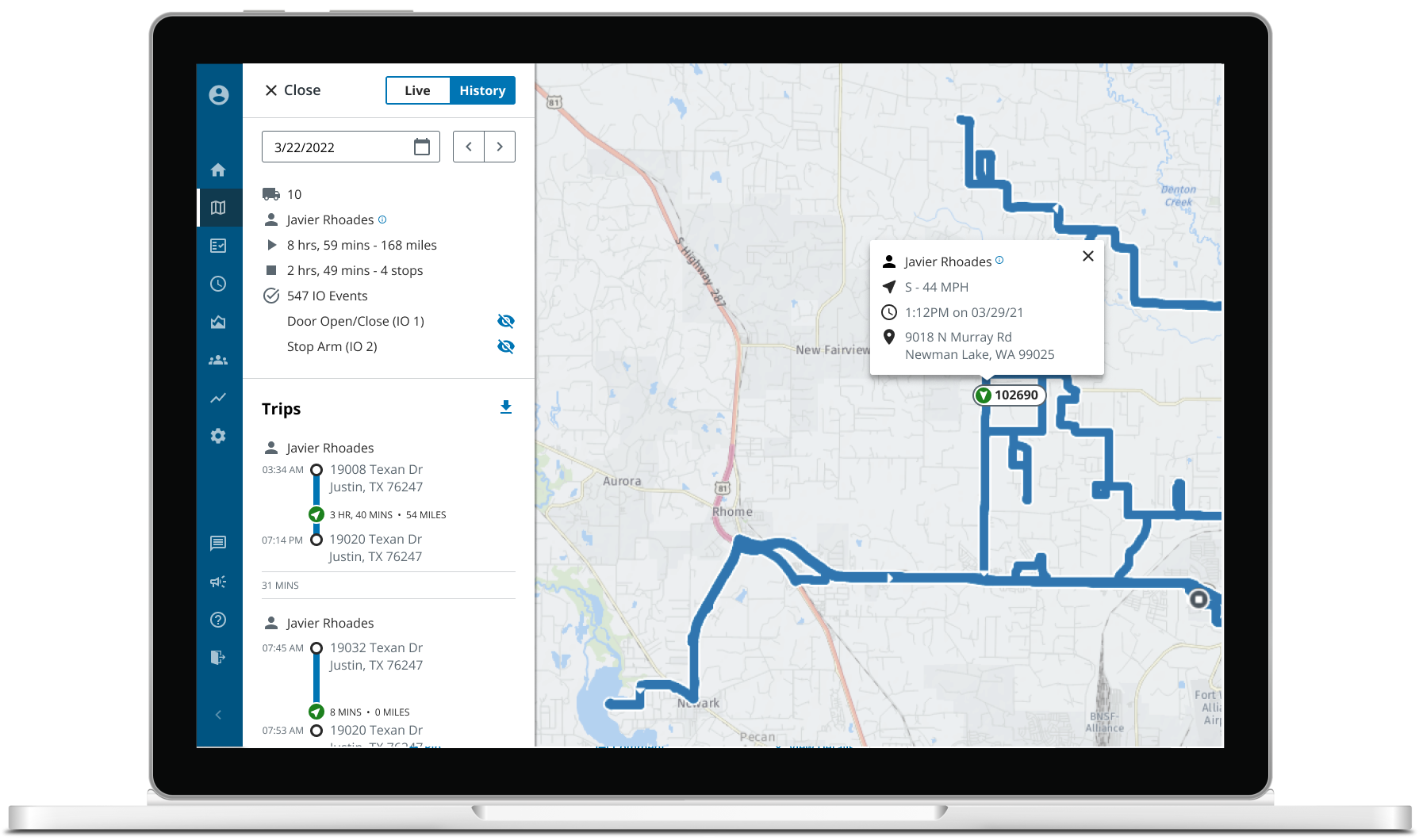
Slide title
Write your caption hereButton
